
USA Swimming Foundation Logo Redesign
Redesign of the USA Swimming Foundation's identity.
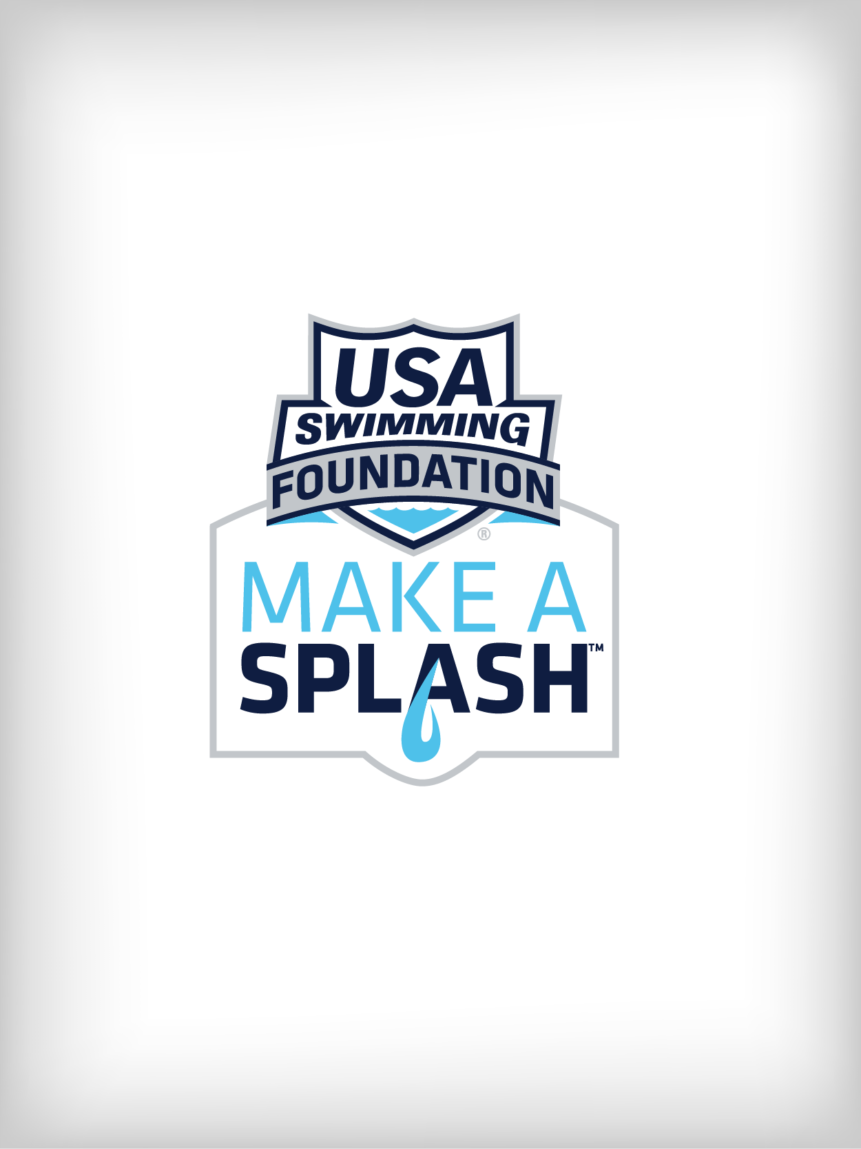
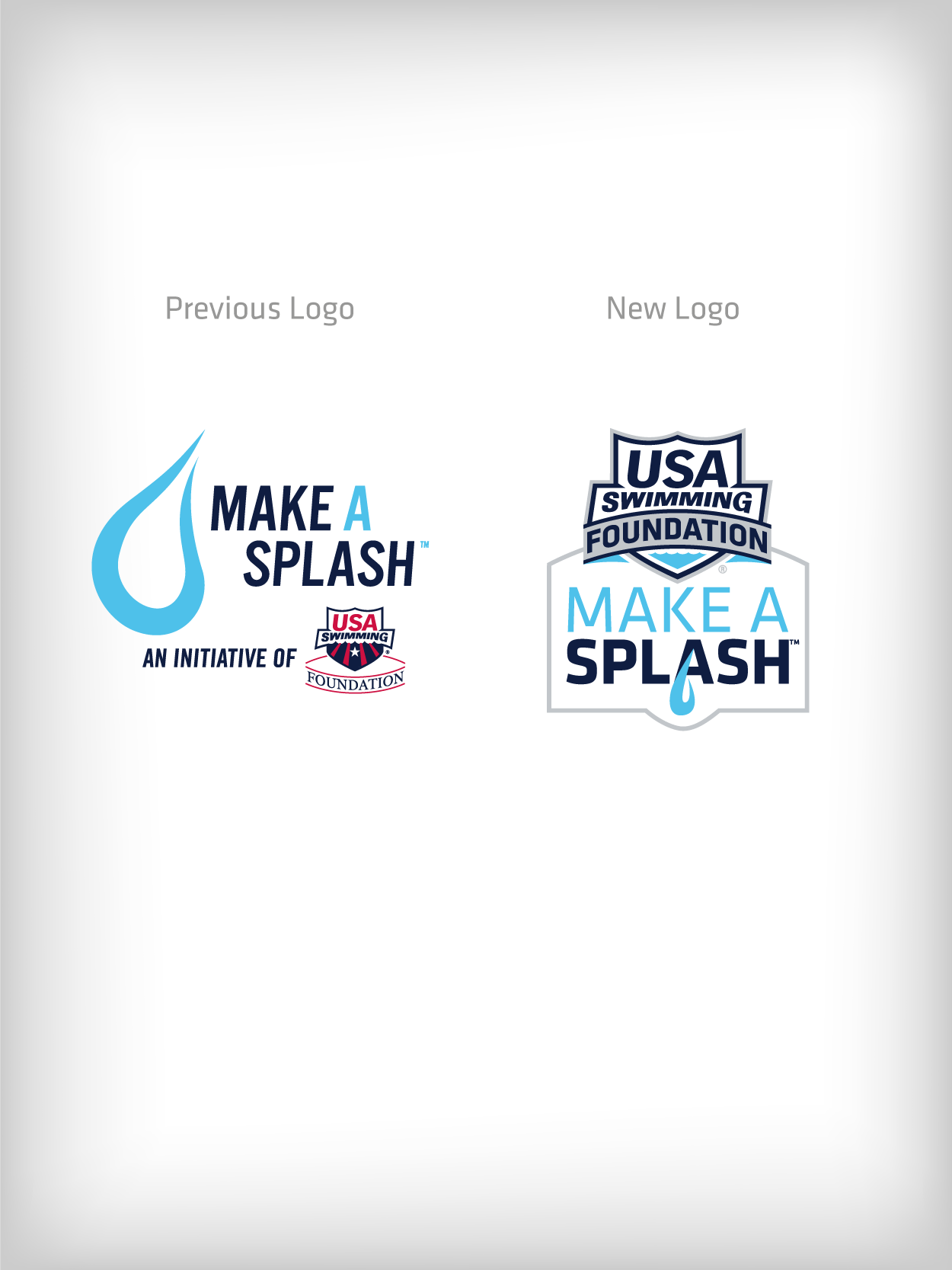
The USA Swimming Foundation was in need of a new way to present its signature Make a Splash program logos in order to eliminate confusion and present Make a Splash as an initiative of the USA Swimming Foundation, instead of the program being mistaken as its own entity.
Looking at all of the disparate logos in place for various programming, it became clear that a more comprehensive overhaul was required.
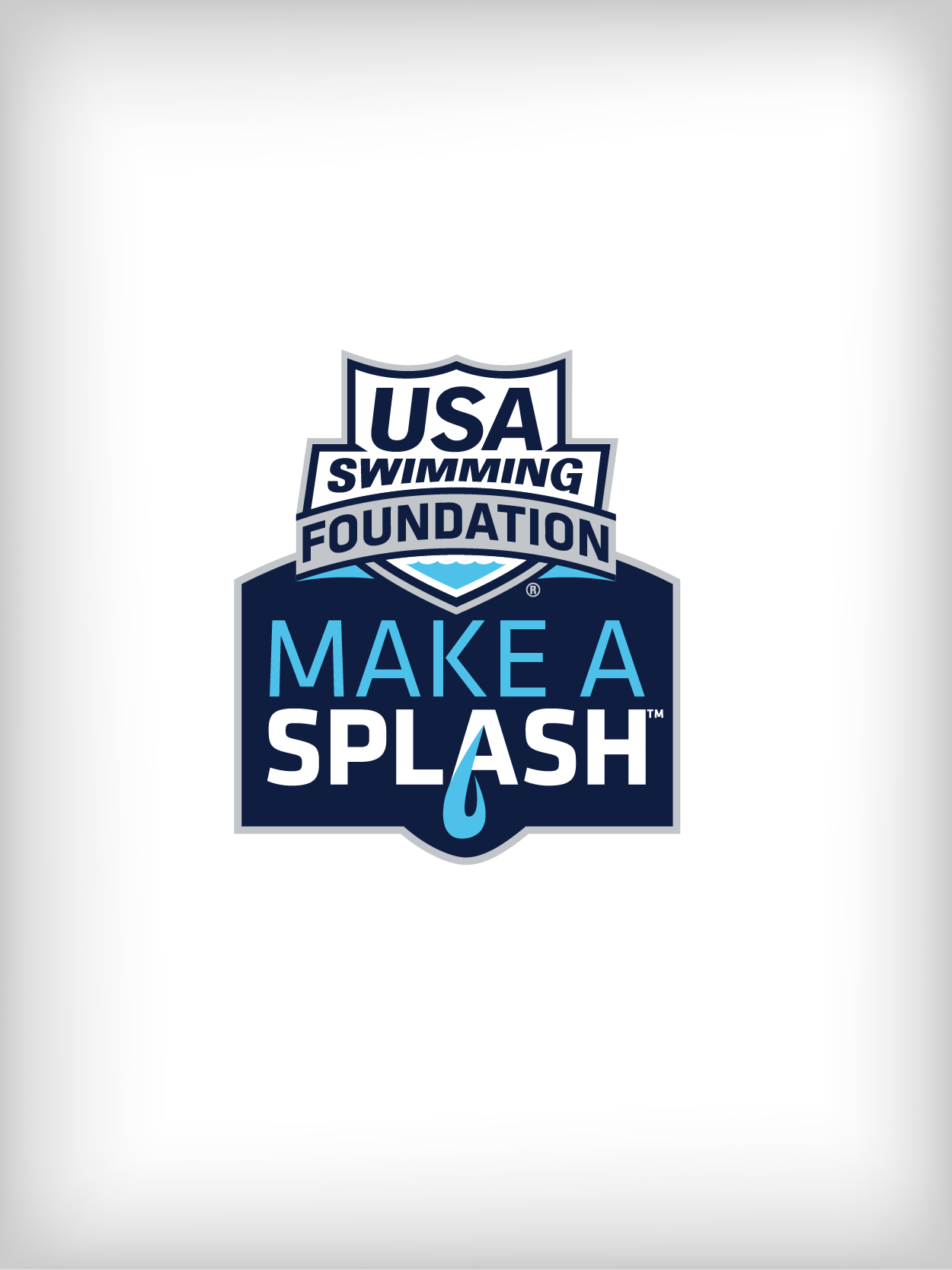
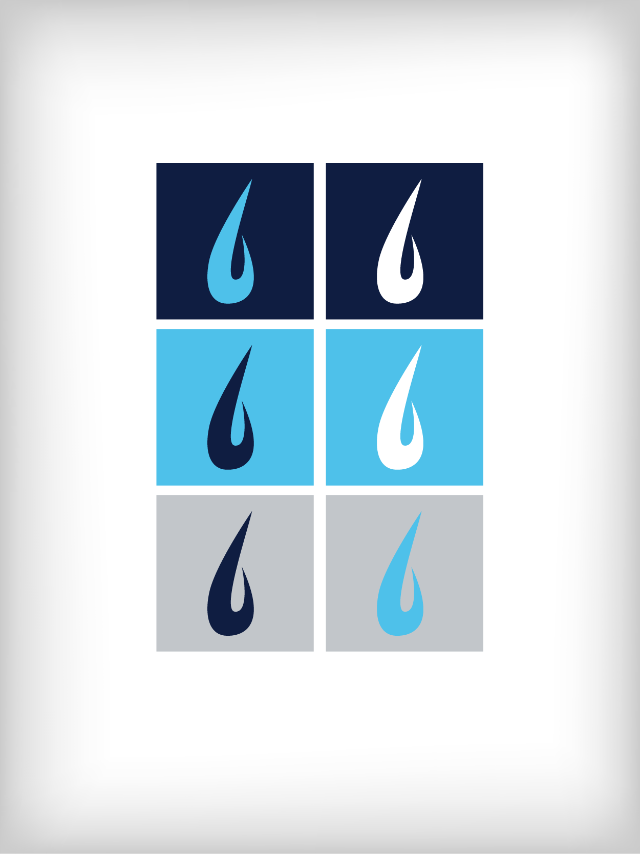
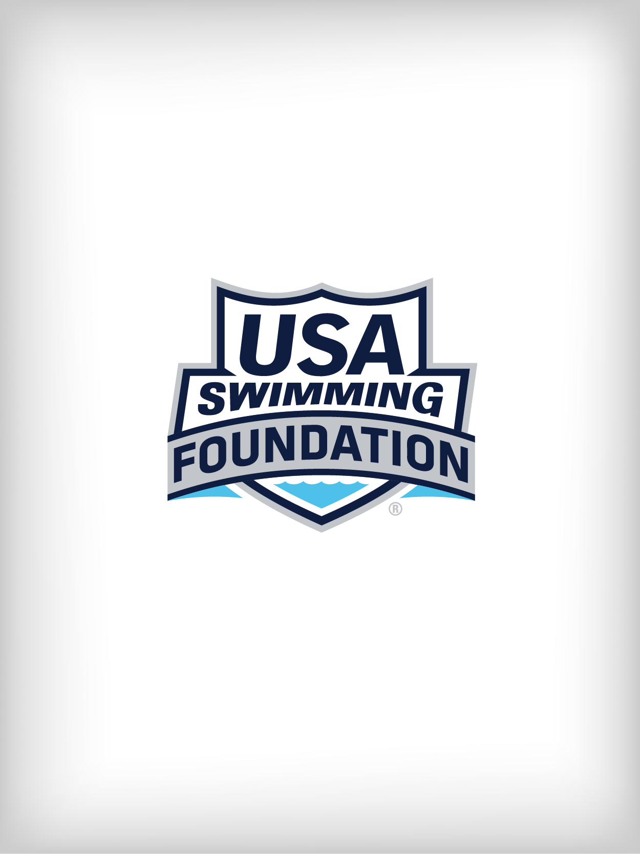
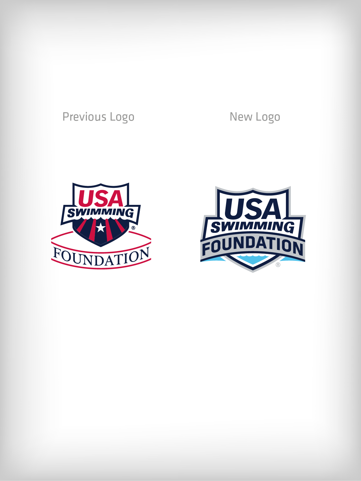
Beginning with the USA Swimming Foundation logo itself, the word “Foundation" was brought into the USA Swimming shield and made to arch upward, using a bolder font to increase readability. The colors were changed to reflect the Foundation’s unique mission of Saving Lives (Aqua), and Building Champions (Navy blue).
The new Foundation logo filters down into all Foundation programs, and will begin appearing on all communication pieces.
The new Make a Splash™ logo is designed in such a way that the USA Swimming Foundation logo is the primary focus, but also so that the newly reworked Make a Splash water drop icon maintains a presence as a integral part of the text mark. The logo will better serve as a more compacted, unified identity for Make a Splash.
USA Swimming's Make a Splash™ program identity